
Case study
Toot Sweet Brand Refresh
Overview
The project.
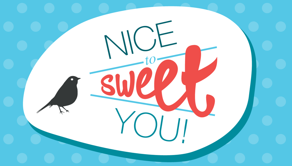
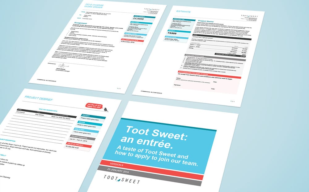
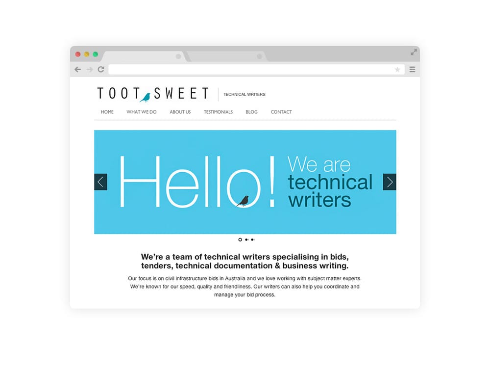
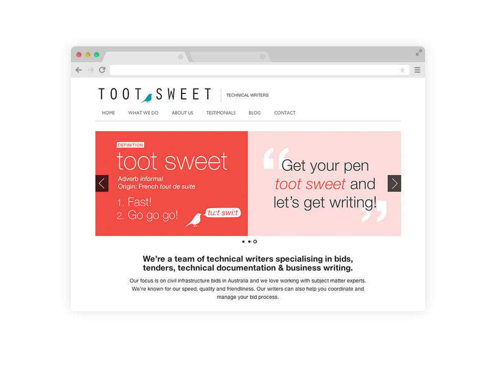
Toot Sweet needed a little more spark, so I set out to refresh the brand while staying true to its playful spirit. The original secondary colors had been hiding in the background, so I brought them forward, adding energy and dimension to the visual identity. Now, with a brighter palette and a bolder presence, ‘Frank the Bird’ finally has the personality and flair to match the brand’s vibe.
The work
Selected pieces.
Credits
Creative Agency: By Pu
Creative Director: Pu Koh
Senior Designer: Pu Koh
Designer: Pu Koh
Work with me.
Tell me what you're working on. Whether it's a tender bid that needs to win, a brand that needs sharpening, or a pitch deck that needs to land, I read every inquiry personally.
hello@bypu.com