
Case study
China Century Capital
Overview
The project.
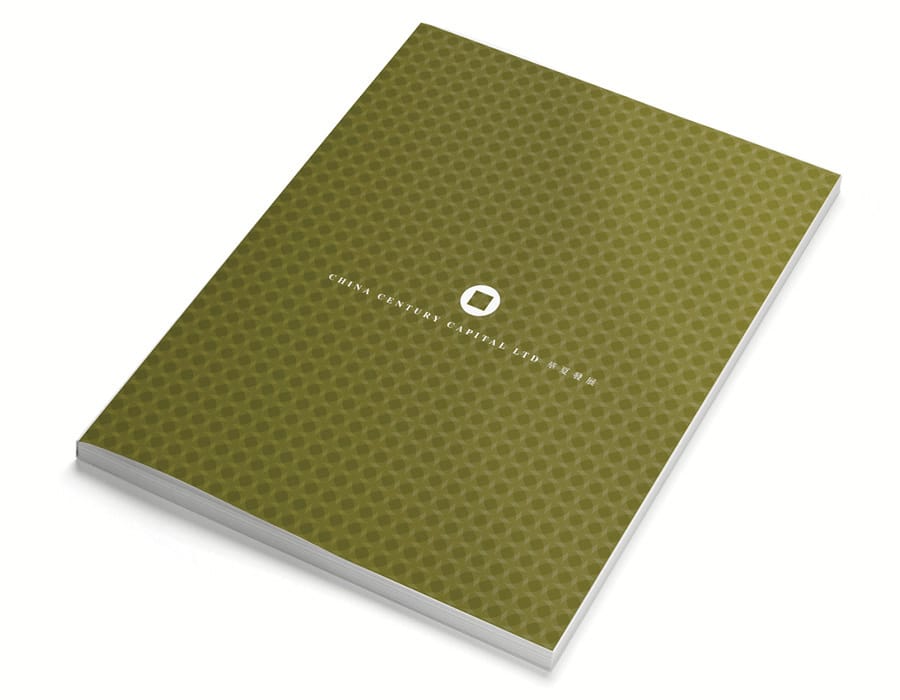
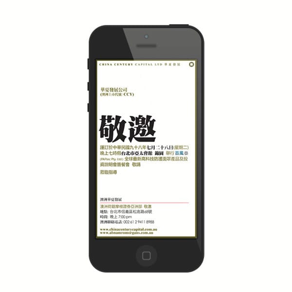
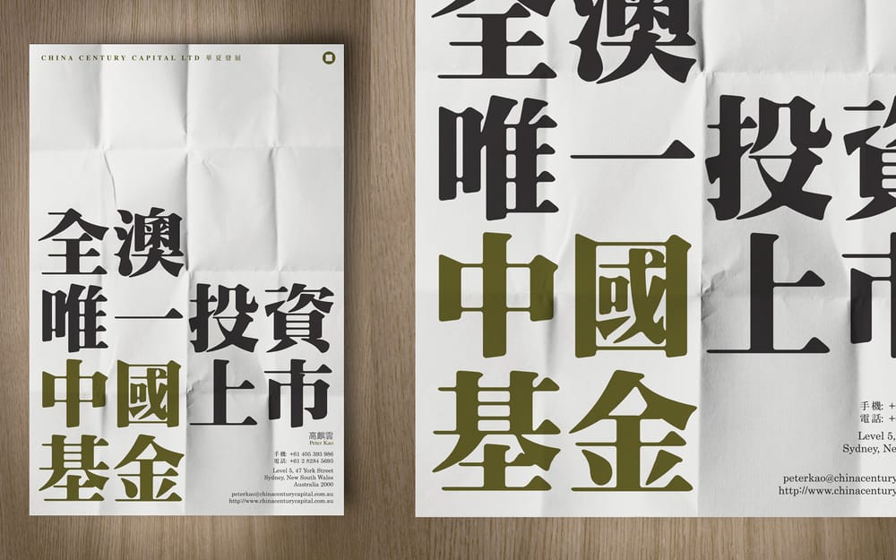
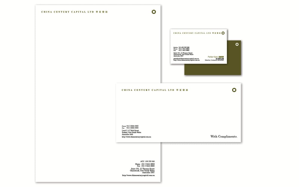
For this newly listed firm investing in high-impact projects across China, I crafted a brand rooted in cultural symbolism and modern sophistication. The visual identity centers around the iconic shape of ancient Chinese coins, representing wealth, continuity, and trust. Gold was chosen to symbolize prosperity, while a subtle dash of red nods to good fortune and success. The result? A distinctive, meaningful brand that bridges tradition and ambition.
The work
Selected pieces.
Credits
Creative Agency: By Pu
Creative Director: Pu Koh
Senior Designer: Pu Koh
Designer: Pu Koh
Work with me.
Tell me what you're working on. Whether it's a tender bid that needs to win, a brand that needs sharpening, or a pitch deck that needs to land, I read every inquiry personally.
hello@bypu.com